Beyond the Mist — Card & Board Redesign
An information-design case study. Six unmoderated user-research sessions surfaced the same complaint across every group: too much to track at any given moment. The system worked — the interface didn't. I rebuilt the iconography system, restructured visual hierarchy on every card, and designed three physical boards as ambient rule containers. Setup time dropped from ~15 minutes to ~5; the “I get it” moment moved from turn 5 to turn 1; and feedback in subsequent sessions shifted from “I don't understand this” to “tune these numbers” — the signal that the interface was no longer the bottleneck.
What testers said
Two unmoderated sessions (sessions #1 and #2) with fellow designers. The mechanics landed once explained, but the explanation took too long — and the cards themselves weren't doing the explaining. The complaint was unanimous: too much to track at any given moment.
The signal
By Week 5 the game's systems were locked in: card type/subtype matching, the land deck modifier system, the deception layer through Endgame Encounters. I'd run two blind group user sessions with other designers from the program, and both came back with the same top-priority feedback:
“Information overload — too much to track at all times.” Setup took ~15 minutes. The “I get it” moment didn't arrive until turn 4 or 5. Users couldn't quickly identify card types and synergies during play, and the rules existed only in the rulebook, not on the table.
What I asked them
After the second user session, I sat down with each tester individually with the cards in front of them, and asked four questions:
- “What did you look at first when this card was dealt to you?” Mostly: the artwork. Then: the largest text. The Type and Subtype labels — which were the most game-relevant info — were noticed last or not at all.
- “What did you have to look up that you wished was on the card?” Universally: the dice type. They had to flip to the rulebook every time.
- “Where did you keep your discard pile?” Different answers from each tester. There was no designated location, so each user improvised — a classic information-architecture failure.
- “What broke immersion?” Re-reading the rulebook mid-game.
Mentor framing
My mentor Jeremiah Franczyk (Lead Designer on LoTR Online and D&D Online) pushed me on this in our Week 5 review: “the design is sound — the game is currently failing at the interface, not at the systems.” He recommended a complete graphic overhaul before the next user session, and specifically asked for an old-vs-new comparison so the iterative leap would be visible.
Key insight: Users who report “there's too much to track” rarely mean “reduce the system.” They mean “put the system somewhere I can scan instead of read.” That's an information-design problem, not a content problem.
The actual problem
I rewrote the “information overload” complaint into three concrete failure modes. Each one mapped to a specific surface in the game — cards, table layout, or rulebook — and a specific intervention.
Three failure modes
| Failure | Surface | Success looks like |
|---|---|---|
| 1. Cards require reading, not scanning | Card faces | Type, Subtype, and dice are recognizable in <1 second without literacy. |
| 2. Persistent state has no fixed location | Table layout | Deck, discard, gold, and health each have a designated zone, the same for every user. |
| 3. Rules live off-table | Rulebook | Common rules are printed on the boards next to where they apply. Rulebook only for edge cases. |
Constraints
- Two weeks. Week 6 of an 8-week project. Cards and boards both had to be designed, exported, and ready for the next user session.
- No new mechanics. The systems were locked. This was an interface pass, not a redesign.
- Print-friendly. The prototype runs on Tabletop Simulator, but I wanted everything print-ready in case we did a physical user session.
- One designer. Solo across cards, boards, iconography. No illustrator on the project.
Design intent: Three failures, three workstreams. “Fix information overload” is a sentiment. “Replace text labels with icons on the type matrix, and design a Player Board with deck/discard zones” is a Tuesday afternoon.
Design directions
For each failure mode I drew at least two alternatives, then picked based on three criteria: scan speed, production cost in the remaining two weeks, and thematic resonance with the game's foggy-island setting.
Cards — iconography over text
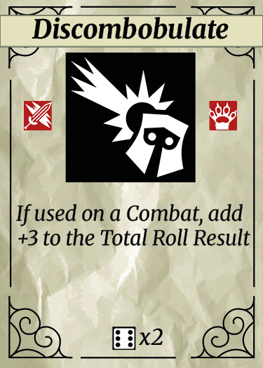
Use a single color border for each Type, no symbols. Pro: Fastest to scan. Con: Subtypes (12 of them) can't be color-coded distinctively. Rejected as primary system, kept as reinforcement.
A custom icon for each of the 4 Types and 12 Subtypes, color-tinted to match the Type. Pro: Scannable AND distinctive. Con: Larger production cost — 16 icons to design. Worth it.
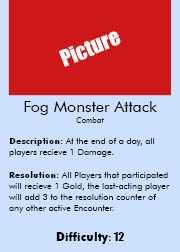
Encounter cards — the framing problem
An interesting constraint: encounter cards always sit on top of a Land card during play. So the encounter card's frame was being visually doubled by the Land's frame. I sketched two versions:
- Both framed. Visual noise. Two borders fighting each other.
- Borderless encounter, Land as the frame. The Land card becomes the visual container; the encounter is the content. Chosen. This also reinforced the game's design principle that encounters are determined by where they happen.
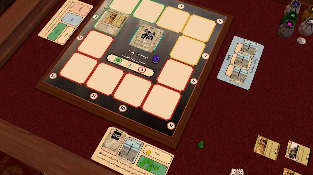
Boards as rule containers
I sketched three boards on paper before opening Figma:
- Player Board. Deck zone, discard zone, health track, gold counter — with the rules for each printed directly on the board. Rules cease to be “memorized facts” and become “ambient labels.”
- Shop Board. Shows available items and action cards for purchase, prices visible, with the buying rules printed in the margin.
- Map Board. Numbered land-card placement zones (1–12). The land draw order and timing rules sit in the margin.
Mentor feedback: Jeremiah pushed back on my first map board sketch — called it “daunting to look at.” That feedback became its own iteration: simplify the placement grid, reduce the marginal text density.
What I built
Designed in Figma over two weeks. 16 icons for the type/subtype system, 12 encounter cards, ~30 action cards, three boards. Exported as Tabletop Simulator decks for the next user session round.
The icon set
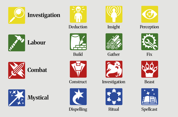
Each of the 4 Types got a primary icon (combat, control, support, soft-PvP) tinted in its Type color. Each of the 12 Subtypes got a secondary icon. On a card you read the Type icon first (color +shape) and the Subtype icon second — matching bonuses become recognition, not lookup.
Card templates
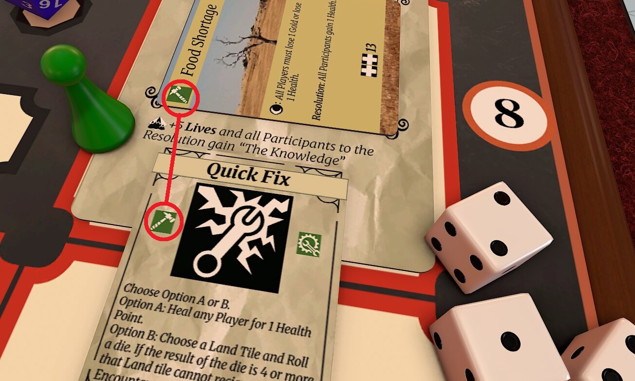
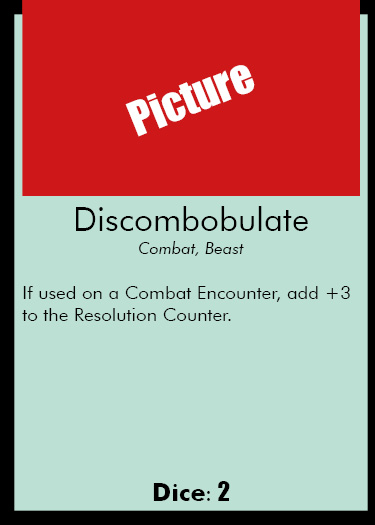
Action cards followed a strict template: name and dice icon at the top, art in the middle, Type/Subtype icons in a fixed bottom-right cluster, flavor text minimized. Encounter cards used borderless artwork as their full background, with the Land card providing the frame at play time.
The three boards
Player, Shop, Map. The Player Board has deck and discard zones with rules in the margin (“Draw 5 at start of turn,” “Discard remaining at end of turn”). The Shop Board has slots for items and prices, with the shop rules in the margin. The Map Board has numbered zones for the 12 lands with timing rules.
Implementation note: Building a strict card template paid off the same way the button-feedback system did on Idle Crops — once the system existed, each new card cost minutes instead of an afternoon. The icon set was the slow part; everything that used the icon set was fast.
What changed in user session
Four more unmoderated sessions (#3 through #6) after the overhaul. Setup time dropped, the “I get it” moment moved earlier, and the feedback shifted from “I don't understand this” to “tune these numbers” — the signal that the interface was no longer the bottleneck.
Session #3 — first run with the new cards and boards
Setup time: ~5 minutes (down from ~15).
Worked: Players self-paced. The “I get it” moment came in turn 1 or 2. No one asked where to put their discard.
Didn't: The Map Board's numbered zones were still confusing on first encounter — players placed the first land in the wrong slot.
Changed: Added a directional arrow and a “1” emphasis on the first slot.
Sessions #4 & #5 — tuning territory
Focus: Economy and pacing. Shop pricing, reward amounts, day-to-day difficulty scaling.
What this signaled: Feedback had shifted from “I don't understand this” to “this feels too easy/hard.” That's the signal that the interface was no longer the bottleneck — remaining work was numerical.
Session #6 — balance only
Feedback was specifically about balance. Jeremiah's exact framing: “the fact that feedback is specifically related to balance means you're close.”
What the feedback progression showed: Week 4 — “I don't understand this.” Week 6 — “I understand but it's too much information.” Week 7 — “The information is clear but the numbers are off.” Week 8 — “Just tune the numbers.” Each iteration solved the top-priority problem and revealed the next layer underneath.
Before & after
Same systems, same numbers (mostly), same artwork in many cases — just a different approach to information surface. The mechanical complexity didn't change; the interface caught up to it.
Action card — old vs new
Encounter card — old vs new
What changed
- Icons over text. Type and Subtype identified at a glance. Matching bonuses become spatial recognition, not reading.
- Dice icons. The dice type to roll is shown as an icon — no rulebook lookup.
- Visual hierarchy. Names prominent, effects secondary, flavor text tertiary.
- Encounter framing. Borderless artwork on encounter cards. Lands act as the frame, reinforcing the design principle that location modifies encounter.
- Boards as rule delivery. Player, Shop, and Map boards with rules printed directly on them. “Imaginary areas of play” that had to be explained verbally became visible zones.
Mentor feedback: Jeremiah specifically recommended showing the old-vs-new comparison in the portfolio — “to show the iterative leap from first playable to finished version.” This is that comparison.
Lessons learned
What worked
- Treating “information overload” as an interface problem, not a systems problem. The instinct after the user session complaints was to cut systems. Cutting systems would have made the game weaker. Redesigning the interface kept the depth and removed the friction.
- Building a strict card template before designing individual cards. Once the template existed, each new card cost minutes. Without it I'd have been redesigning cards card by card and never finished.
- Boards as rule containers. Pulling rules out of the rulebook and onto the table where they apply was the highest-leverage change — one design decision, dozens of rule lookups eliminated.
What I'd change with more time
- Card template stress-test. Some cards have unusual effects that the template couldn't fully accommodate — I had to compress flavor text or use smaller icons. A template revision pass with the outliers in mind would have caught this.
- First-run onboarding. First-time setup is still a process. A “Quick Start” mat that walks new users through their first turn would lower the activation barrier even further.
- Color-blind verification. The Type colors are distinct in normal vision but I never tested protanopia/deuteranopia. The icon shapes were chosen to be distinguishable independent of color, but I'd want to verify before any wider release.
What I learned
- Information design is empathy work. Every choice on the card — size, position, symbol vs. text — is a choice about what the user sees first when they're tired, distracted, or new. Designing for the worst-case context, not the best, is the rule.
- Cohesion between system and surface is free clarity. The Land-as-frame solution worked twice: once at the system layer (the Land really does modify the encounter) and once at the visual layer (the frame really does contain the content). When the model and the interface say the same thing, users intuit rules before reading them.
- Users describe symptoms, not causes. Their report was “too much information.” Their suggested fix would have been “remove some.” The actual fix was to surface the same information differently. Listening to a complaint is necessary; implementing the user's suggested solution rarely is.