Idle Crops Tycoon — UI Overhaul
The first build shipped working but felt unfinished — buttons didn't respond on press, modals were inconsistent, hierarchy was flat. In a market where install decisions happen in seconds, perceived quality is a retention lever. I led a focused interaction-design pass — standardized feedback, unified modal patterns, gesture navigation, a layer of micro-interactions — without changing a line of core product logic. Designed in Figma, implemented in Unity UGUI with DOTween.
What was breaking
Internal stakeholders flagged the UI as “prototype-feel.” I confirmed it through a structured competitor audit of three reference apps, comparing every screen of ours against published mobile interfaces. The issues weren't in the product logic — they were in feedback responsiveness, visual hierarchy, and modal consistency.
The signal
Three weeks before our internal milestone, the producer noted in a build review: “the game feels good to play but looks like a prototype.” The systems were balanced (100 levels of progression, six enemy types, an economy I'd already iterated three times) but the screen between the user and that work was failing it.
How I dug in
Before opening Figma, I did three things:
- Reference audit. Played AdVenture Capitalist, Adventure Communist, and Pokémon TCG Pocket for 30 minutes each, taking screenshots of every screen. I cataloged what they did with button feedback, pop-up framing, navigation, and information density.
- Internal interviews. Sat down with the programmer and producer separately, asked them to describe the game's feel without using the word “UI.” The answers (“flat,” “quiet,” “you can't tell when you've done something”) pointed at feedback, not aesthetics.
- First-time-user walkthrough. Used our build for 20 minutes with a notepad, logging every moment I hesitated, double-tapped, or wasn't sure whether the interface had registered an action. Button feedback issues surfaced six times.
Key insight: The complaint “prototype-feel” is rarely about visual style. It's almost always about the absence of feedback — the screen not responding to you. Style fixes don't solve that, motion does.
The actual problem
I rewrote the team's complaint into four concrete, testable problems. Once they were named, the solution stopped being “polish the UI” and became four targeted workstreams.
The reframe
The team said: “the UI looks like a prototype.” That's a sentiment, not a problem. From the audit and the friction notes I rewrote it as four problems:
| Problem | Evidence | Success looks like |
|---|---|---|
| 1. No tactile feedback | Buttons don't visibly respond on press. I double-tapped six times in 20 min. | Every interactive element has a visible state on press and release. |
| 2. Pop-ups feel placeholder | Wallpaper-style backgrounds, no styling consistency between pop-ups. | One pop-up framework. All pop-ups read as part of the same product. |
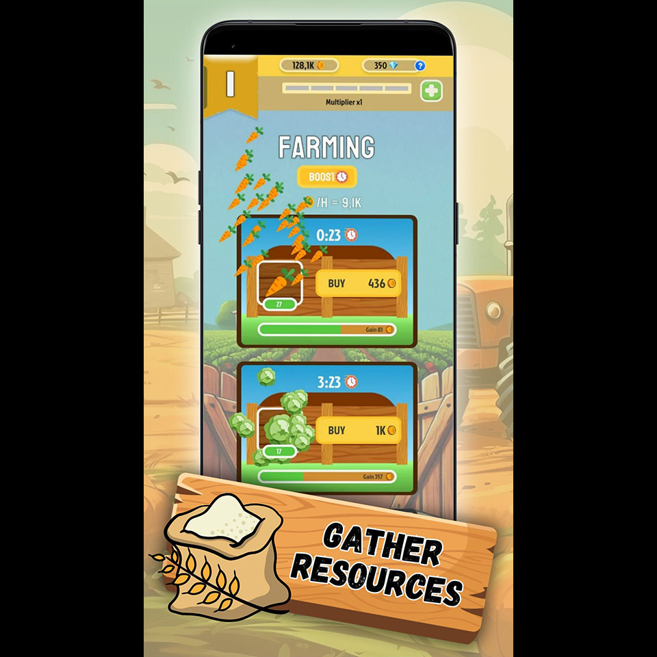
| 3. Information hierarchy is flat | Crop timers and income use the same weight. “Where do I look?” in audit notes. | User can locate primary state (gold, active timers) within one second. |
| 4. Navigation is rigid | Tab switching is instant cuts. Users don't know they can go back. | Transitions communicate where the user is relative to where they came from. |
Constraints
- No core product-logic changes. Production wanted to ship this milestone with the existing systems intact.
- Three months including implementation. I'd be designing AND coding the result. Anything I designed had to be cheap to ship in Unity UGUI.
- Performance budget. Mobile target. No heavy shaders, no per-frame Canvas rebuilds.
Design intent: Four problems, not one. “Polish the UI” is unsolvable; “add scale-down feedback to every button” ships in a week.
Directions explored
Three visual directions on paper, three pop-up framing systems on Figma. Picked the one that was distinctive enough to feel like a product but cheap enough to ship in Unity UGUI within the budget.
Three visual directions
Pros: Distinctive, premium feel. Cons: Out of budget — would need a dedicated illustrator we don't have. Also brittle: every new screen needs new art. Rejected.
Pros: Cheap, fast. Cons: Generic — every other Unity hypercasual on the store uses the same packs. Doesn't solve the “feels like a product” problem. Rejected.
A small set of patterned wood textures for modal frames, paired with a tactile-feedback motion system and a layer of celebratory micro-interactions. The textures are reusable; the motion system is a one-time investment that benefits every screen. Distinctive enough to feel like a product, cheap enough to ship in three months.
Sketches
Once C was picked, I sketched the four targeted fixes in Figma:
- Feedback system. Scale-down on press (0.92), scale-up on release with a small overshoot (1.05 → 1.0). One animation curve, one duration, applied uniformly.
- Pop-up framework. A single base frame with the wood texture, a header, a body slot, and a primary/secondary CTA pattern. Every pop-up in the game inherits from this.
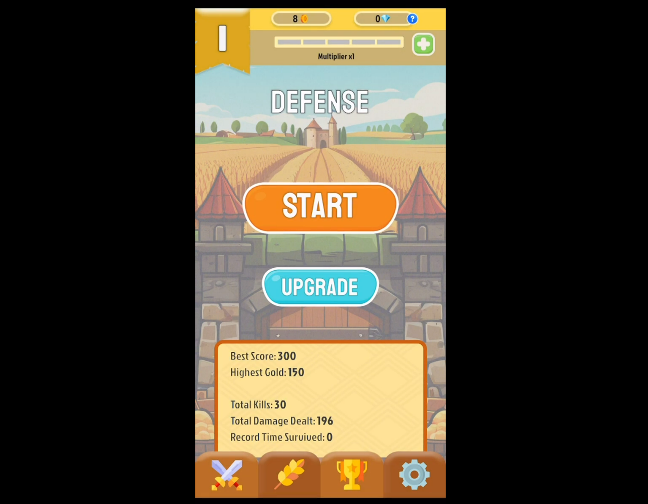
- Information hierarchy. Icons next to crop timers, “Gain” labels on income bars, a Wall of Fame scoreboard surfacing total kills and total earnings as the run-summary anchor.
- Navigation. Swipe transitions between tabs — the user's finger physically tells them where they're going. Inspired directly by Pokémon TCG Pocket.
What I built
Implemented in Unity UGUI with DOTween for motion. Designed the screens in Figma, then ported them into prefabs — reusing the same base prefab anywhere the same pattern appeared. Built once, used everywhere.
Build order
- Feedback first. Built the button-press scale animation as a single MonoBehaviour, attached it to every interactive button via prefab inheritance. One day of work, applied to every screen.
- Pop-up framework second. Replaced the existing pop-ups with the new base prefab. The achievement claim, the prestige confirmation, and the rewarded-ad prompt all use the same skeleton.
- Hierarchy third. Added the icon set, repositioned the income bars with explicit “Gain” labels, built the Wall of Fame scoreboard.
- Navigation last. Swipe transitions came last because they touch the most code — everything else had to be stable first.
Implementation note: Building the feedback system first paid for itself immediately. Every screen I touched after that already felt right because the buttons did. The remaining work was just visual layout.
What came back
Two rounds of usability testing during the overhaul, with a stakeholder debrief after each. Findings drove specific tweaks to modal dismiss timing, achievement-claim feedback, and the swipe distance threshold.
Round 1 — week 4 internal test
Worked: Buttons register on press — reported as the standout improvement. Modal framework reads as a single product surface.
Didn't: Achievement claim was anticlimactic — users would unlock something and the screen barely acknowledged it. Modal dismiss felt too abrupt on confirmation.
Changed: Added a celebratory micro-interaction on claim (particle burst + scale pulse on the badge). Increased modal dismiss duration by 200ms.
Round 2 — week 8 internal test
Worked: Swipe transitions discoverable — everyone tried them within the first minute. The Wall of Fame became a session-summary anchor people kept checking.
Didn't: Swipe threshold was too sensitive — accidental tab changes when scrolling lists. End-of-battle background was static against an animated foreground — felt off.
Changed: Raised the swipe distance threshold and added a horizontal-only filter. Animated the end-of-battle background.
What the feedback progression showed: Round 1 was structural (“the new system works but doesn't celebrate”). Round 2 was tuning (“the system works, fix the numbers”). When feedback shifts from structure to tuning, you're close.
Before & after
Same game, same screens, three months apart. The functional layout barely changed — what changed is what the screen does when you touch it.
What changed
- Tactile feedback. Scale-down/scale-up pulse on every button (buy, claim, confirm, cancel). One animation system, applied via prefab inheritance.
- Pop-up overhaul. Patterned wood-textured backgrounds, consistent header/body/CTA structure. Replaced the placeholder “wallpaper” effect across every pop-up in the game.
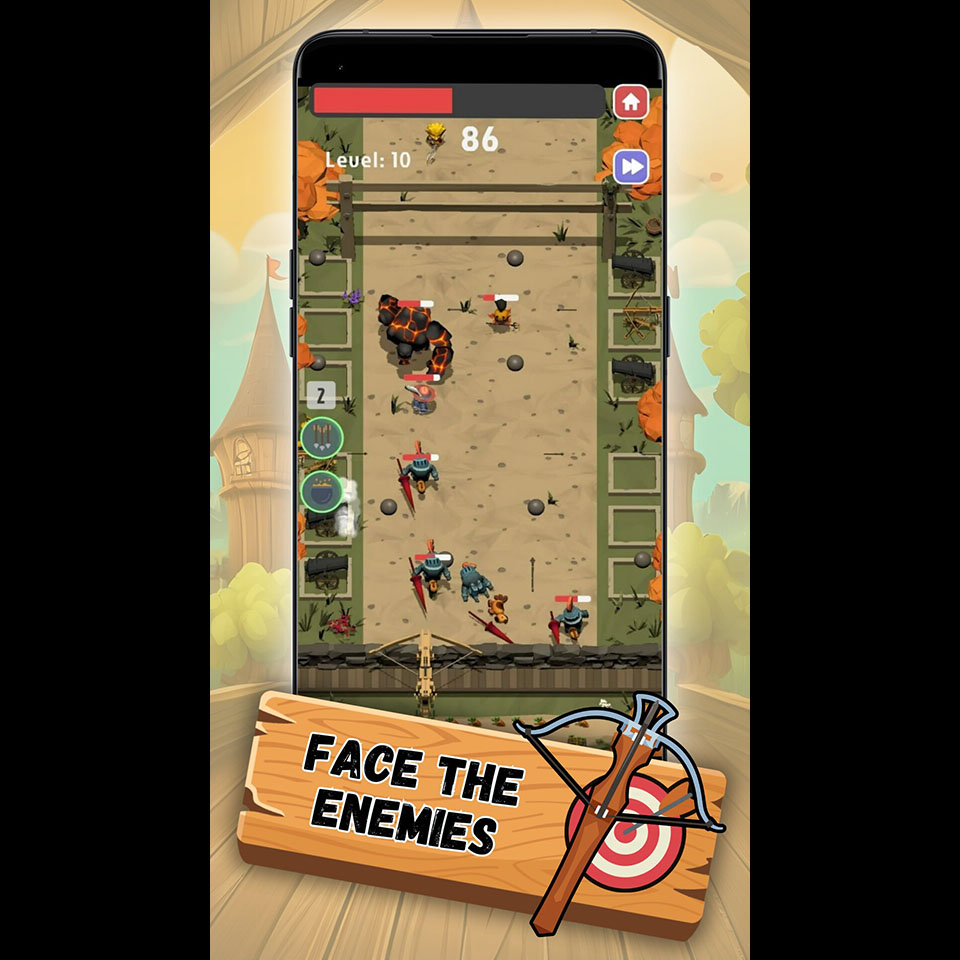
- Micro-interaction layer. Celebratory feedback on achievement claim, animated end-of-session background, refined projectile effects across the defense screen.
- Information architecture. Crop-timer icons, “Gain” labels on income bars, a Wall of Fame scoreboard with total kills and total earnings.
- Navigation. Swipe transitions between tabs — horizontal-only, with a tuned distance threshold so list-scrolling doesn't accidentally trigger them.
- Achievement system UI. Multi-step achievements with visual progress indicators and proper save/load persistence.
Team feedback after the overhaul: “With this background and the UI fixed up like this it already looks like a completely different game.” — internal testing notes.
Lessons learned
What worked
- Reframing the complaint into testable problems. “The UI looks like a prototype” would have been months of unfocused work. Four named problems with named success criteria turned it into four ship-ables.
- Building feedback first. The single biggest perceived-quality lift came from the button animation system. Everything I built afterward inherited that feel for free.
- Reference audit before sketching. 90 minutes of structured play with screenshots saved me weeks of iterating on visual style.
What I'd change with more time
- Animation curves audit. I picked one curve early (an ease-out-back overshoot) and used it everywhere. Some moments wanted a softer curve — pop-up dismiss, for instance. Worth a dedicated motion-language pass.
- Hit-state spacing on small buttons. The 44pt minimum was sometimes tight on dense screens. I'd revisit the achievement-list UI with proper touch-target padding.
- Onboarding for the swipe gestures. Discoverability was acceptable in testing but there's no formal onboarding for the gesture. With more time I'd add a one-frame swipe hint on first launch.
What I learned
- Style is the cheap part. Motion is the expensive part — and the part that matters. The pop-up wood texture took an afternoon. The button feedback system took two days but is what made the game feel like a product.
- Implementing my own designs taught me what's expensive to ship. Things that look identical in Figma can be 10x apart in Unity UGUI. That awareness made me a better designer for everything I designed afterward.
- Users describe symptoms, not causes. Stakeholders felt the product was “quiet.” The solution wasn't louder visuals — it was responsive ones. Listening to a complaint is necessary; implementing the user's suggested fix usually isn't.